
I looked at the Prima Watercolor Confections sets so many times and told myself no. Partly because I don’t need any paints, seriously, you know this if you’ve been reading these reviews. The other part was my inner art supply snob- I told her to shut it. My plan is to use these in my planner and art journal. At the end of the day, I care that these bring joy to my experience. I don’t care if they are lightfast, or transparent- I’m using them in an art journal for personal expression, not professional endeavors. To coin a silly phrase- I’m a funfessional. I’m in it for the fun of it, and discovering about myself. If you’re a funfessional too, you might like this review.

These are distributed by Prima Marketing, an arts and crafts supply company based out of Chino, CA. They are sold/marketed as “artist-grade,” but that means different things to different people. These are not the same quality as Daniel Smith, Winsor & Newton, Holbein, and the like. But hey, I’ve seen awesome things created using a can of spaghetti as a medium, or this guy who paints with a flame. Cai Guo Qiang uses fireworks- if you haven’t seen the documentary Sky Ladder, I recommend it.
These paints make me hungry for sweets! Especially the Pastel Dreams with their dream-frosting-like quality. All kinds of frosted baked goods dancing around in my mind. Many of the paint colors have food or vacation names.

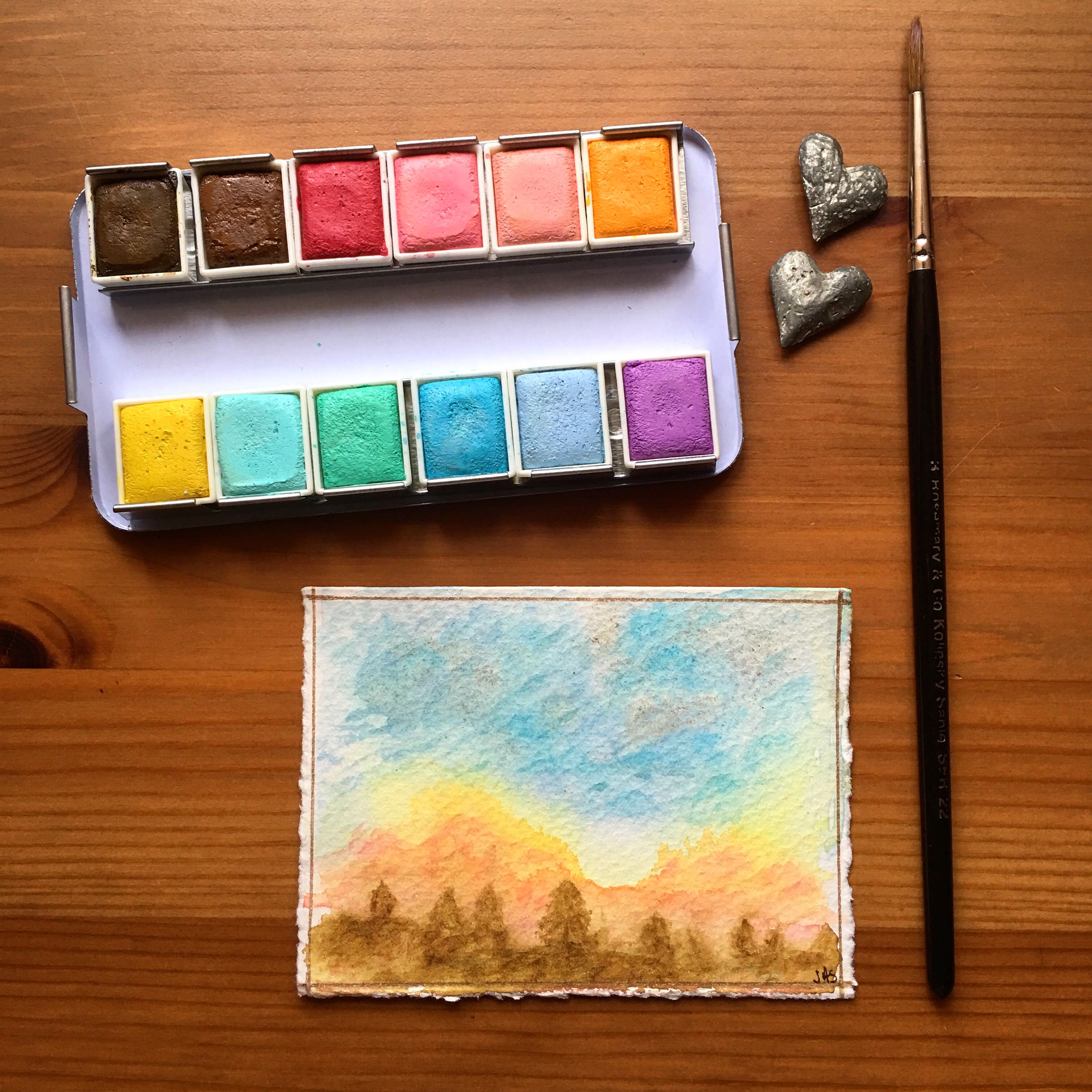
All sets are twelve colors and come in a nice metal paint tin with a numbered swatch card. The swatch card is weird, it has a laminated coating on it. I’ve read some comments that the pans are loose in the rails and pop out easily. No need to attach magnets are do anything fancy, just bend the metal rails in a bit, and voila! They snap in perfectly. There are ways to modify these little tins to hold more pans. See this post for that info. From these side views of the pans, you can see that the paint cube surfaces have a rough look/consistency to them.


The Pastel Dreams set is not very transparent. All but the browns seem to have white paint in the mix. That of course, is how they get the lovely pastel colors. They also have a bit of a strange consistency, a little grainy, they don’t appear grainy on paper though. For the most part, they rewet pretty well. I had to scrub my brush around in them a bit more than in a professional quality brand. The journal swatches and examples are in a 4″x 6″ Stillman & Birn Gamma Series. Not going for fine art here, more like a Christmas tree spaceship kind of look. Also used some matchy matchy Gelly Roll pen colors. Love #39 Crimson paint.

The first four pans in the Decadent Pies set have a subtle shimmer/iridescence to them. The fourth pan #28 Rose Petal, is very delicate color and didn’t rewet as easily as the other pans. Next time, I’m going to put a drop of water on that pan before I start to paint. The blues- #35 Blueberry and # 36 Berry Syrup, and the brownish-red #30 Dark Chocolate, are intense colors. Again, not very transparent.

Below is the color chart for their entire line of watercolors and the lightfast ratings. The rating is 1-3, three being the highest. According to their chart, all but three paints- #34 Pistachio, #25 Frosting and #2 Candy, have Excellent lightfastness. I’m not sure how their’s correlates to standard lightfast ratings, if at all. I emailed them and asked for this chart, and additional information about their watercolor products. I received the chart with no additional comments.

I taped this tiny painting to a south facing window in Southern Arizona- almost always sunny. I used a few paints from the Pastel Dreams set, and a bit of gold gouache that’s not translating well in the photo. It hung in the window for three weeks. It takes way longer than this to conduct a proper lightfast test. But, I did what I could. There was no noticeable change or fade.
My conclusion- these are lovely colors, if you think these sets are attractive and fun, then get them. Just be aware of what they are. No telling if they are fugitive, or what pigments are used. The Decadent Pies set was only $15 on Amazon, an additional clue on quality. I paid a little more for the Pastel Dreams- $23, when I wrote this, the price had decreased by a couple of dollars. There are five different sets available. I wouldn’t buy them to mix up a bunch of colors from, go with known single pigment paints for that. I typically don’t mix for colors, and let them do what they want on the page. My bet is that these make mud quick if mixed on the palette. I’ve seen some really lovely paintings/sketches by people using these sets. If you are a fine watercolor connoisseur, or want something for professional pieces, you might want to skip these. Most likely, you already have.
People have been buying the less expensively priced sets for the palette and pans and chucking the paint cubes. Here is another option for doing that, and more palette ideas here and here.
If you are new to watercolor and are learning the skill, invest in the highest quality paints that you can afford, or save up for them- a small set is all you need. Probably not the first time you’ve heard this recommendation. This might seem opposite of what I said in this review. But when you are starting out, you want to give yourself the best chance at learning this fascinating medium, with the least amount of frustration. Lots of reviews here on Doodlewash on many brands of artist quality paints if you need help deciding.
The painting below makes use of both sets. To get a good sampling, I went to town- used about eleven of the colors. I love painting non-reality into a reality. We are here to create and learn.

I can be found on Instagram- @jessicaseacrest, where all my creative outlets are entertained, and sometimes telling signs of what will be reviewed next can be found- like those Miller’s travel brushes in a couple of today’s photos…

All previous review posts can be found under “Reviews” on the menu or click here. Doodlewash has a Facebook group called World Watercolor Group. Huge variety of folks from all over, and a wide variety of painting styles and skill levels. The group is large and growing every day! We have a lot of fun over there, and there are many kind and helpful people in the group. There are also monthly themed daily painting prompts for those interested. If you haven’t already, please join in and share your watercolor creations!


I just bought the Tropicals and the Classics..I have yet to open the Classics..but I love the Tropicals.
So much so that I have now ordered the Decadent Pies..
I would just like to add a dark grey(i.e Paynes Grey)..but I
will wait on Pastel Dreams…
The Tropicals =Lovely to me.
I am not a professional artist..but I do have many Daniel Smith’s Winsor-Newtons and M Grahams..the Kuterake Gansai Tambi set also..and the Koi.
I find the Koi chalkier than the Primas..and my Grumbacher set even more so.
The Primas..granulate..work wonderfull when “jujjed” up w/ water.
I can’t say enough good things about them
And like you mentioned .great case..!And how cute are they?
Eventaully I am almost sure I’ll add the other 2.
That’s awesome Monique. I’m happy to hear you are enjoying them. The Tropicals set looks so bright and fun! I graritate towards the bright side, and find them very tempting. I agree with you, and found these less chalky than the Koi set. Thanks so much for your comment! 😀⭐️
PS..your timing is perfect as I just talked about them on my blog..thanks for all your reviews too!
These seem like fun paints to experiment with and that’s a great approach to watercolor or for a day of thinking in the sketchbook. Thanks for the review, Jessica.
Thanks Sharon. Lovely hearing from you, as always 🙂 Happy painting and sketching!
Thank you for another great review. I had the opportunity to try these in a class. I enjoyed them and over time I purchased all five of these sets. I am not a professional, and I do have higher quality brands, but I enjoy using these Prima sets. I love the colors for what they are, and have no need to mix. I love the compact palette, which is easy and fun to use whether traveling or at home.
Thanks for sharing your experience. All five sets, sounds like a lot of fun! Happy painting 🙂
I bought the Tropicals set, mostly for the paint box. At least one of the blues, maybe both, act like pthlalo blue. Both of the darker greens act like a pthlalo green too. The duller yellow acts a lot like yellow ochre, right down to the very grey cast when it dries. The deep violet acts like dioxane violet. And the magenta acts like quincridone red or rose. So it’s a pretty mixable set.
My big issue with the stock paints is they lift easily. It’s tough to glaze with them. So I have been picking up M. Graham tubes and replacing colors a bit at a time. Yellow ochre was the first to go that way, and just having a nice version of that makes the set a lot nicer. Pulling out one of the reds for a PR101 like M. Graham Terra Rosa also is helpful. Since I tend to do a lot with ink and wash and a carbon ink, I’ve also subbed in lamp black to use as a deep blue. Less annoying than the pthlalo blues, and it blends nicely with the ink I use. A raw umber for the brown, or a sienna could also be good. And most classic earth pigments like these are cheap upgrades.
I love the M. Graham Terra Rosa, such a beautiful color! A couple people have commented that they have found the Tropicals to be a mixable set. Thanks so much for sharing! Happy painting 🙂
I love sharing your reviews, especially today with your new word funfessional – a perfect name for those who practice, practice, practice. This said, I do underscore your reminder that beginners need to purchase the very best supplies they can afford. Otherwise, they blame themselves for everything that goes amiss and sometimes…well…it really is the materials! Thank you Jessica!
Thanks so much Ann. Always does my heart good to read your comments and see your smiling face in the little circle 🙂
Thanks for the review, Jessica! The colors look scrumptious and I like your comments that these are really just for fun. For all of us Funfessionals. (You and Charlie should go into the word-coinage business)
There is something about pastel colored paints that draws me in, it’s usually the pinks that get me. Hehehe, Charlie definitely has a way with words!
A great review, like all your reviews. Information with a personal touch. Love the palettes 😄
Thanks Teri 🙂
They can call them artist grade but I think not. I bought them for the inexpensive tins, removed all the paints and am letting local kids play with the paints. The paints are student grade at best, and many are very chalky. They also disintegrate quickly. Jessica I think you CAN tell people that they are not artist grade: and one of the first clues is that they don’t bother to tell you what the pigments are and what the filler is.
I bet the local kids love you Katie! Like you were saying, not giving out info on the paint contents is a big red flag. Seems like people either love these or hate them. I’ve painted with worse- the Grace Art palette, yeesh! Those were really horrible.
Jessica – thank you for this GREAT review (another one) !!!! I’m reeeeaaaalllly tempted – like you – I have soooo many w/c paints of all the “professional artist grades” but I LOVE your “funfessional” title I just might HAVE TO get at least the Decadent Pies and Pastel Dreams – they are just tooo tempting : )
Blessings, Sandra : )
Thanks Sandra 🙂 If you get these, I hope you enjoy the heck outa them! Best wishes, and happy painting.
Great funfessional review! I think these sets will inspire some people to have fun with their sketchbooks and that’s the point. I love the approach that Prima takes, it’s fresh and different, and will work for many artists.
While I also have far too many paints to buy another palette, it’s inspired me to pop out some of my usual triad and earth colors and put in some neglected oddball colors into my travel palette. With the holidays approaching, I’m going to enjoy iridescents and primateks from Daniel Smith adding some sparkle to my sketches. And I love Moonglow and Undersea Green, and never mix them myself, so why are they hidden in a drawer? I just bought a bunch of empty half pans on Amazon, so will fill them with some of my impulse buy paints and play away.
Sounds awesome Susan! I recently acquired a new iridescent/duochrome from DS, the Cabo Blue. Now I want to put it in everything. I’m with you, love the Moonglow and Undersea Green! One thing I appreciate about the Prima watercolors, they are accessible to people. Especially at the price point and fun colors, and someone might try watercolors for the first time because of these reasons.
Thanks for the review, Jessica. I am glad to see another thorough review of these paints. I had only ever seen a review for the tropical set by Parka blogs so it was great to see some of the other sets reviewed. While I don’t need another set of cheap paints, I’m always a sucker for these little “treats”.
You and me both! I just found the Tropicals set for $11!? And that included shipping! I’m looking forward to it’s arrival. I’m not very good at diluting color and doing things in a subtle way, lately I have been enjoying the opacity of these. But I did one sky that looked like a clown puked it up…I didn’t share that one. Hehe! 😉
Thank you for another really….REALLY!!!…informative review! I got the Tropicals set on the basis of Lindsey/Frugal Crafter’s review. Cute, cute, cute! I added 6 half pans down the center and have a nice little travel thing. Just when I think I’m ‘finished’ shopping for watercolor goodies….I see your reviews or Lindsey’s or Cheap Joe’s has a great sale ;o). I love discovering the world of fun watercolor stuff. Those PAB Neptune brushes you reviewed (and I bought :o) are sweet!
Hi Sheila, thanks so much for you comment! I’m glad you’ve found the reviews helpful. I recently got The Classics set, but have yet to unwrap and swatch. I have a feeling that I might get The Tropicals as a Christmas gift.
I love Lindsay’s reviews and helpful videos! She’s so friendly and inclusive of a lot of different mediums, crafts, and techniques.
Best wishes 🙂
Thank you SO much for sharing the chart that you received from them!! I was honestly mad that the last two sets have names for each color but that the first two did not. It’s silly, but I was infuriated. Haha. Awesome review. I’m just about to blog about this set and wanted to see what other reviews had to say, and your’s has been by far the best. Thanks!
Love from a new follower,
EmK
Thanks so much EmK! Happy blogging!
Hey Jessica! I love the review…the Prima colors are gorgeous and I’ve heard many say they are very vibrant. Do you think as someone stepping up from a very basic (we’re talking Artist’s Loft pans) set to the next level I should try these Primas, or should I go with a set like the Windsor & Newton Cotman 45 Studio set? I’ve heard the W&N are more transparent and lightfast, but the Primas are more vibrant. (I do confess there is a small voice in my head going WHY NOT BOTH?!) But I wanted to see what you thought! Thanks for a great review, I’ll definitely be checking out your other posts!
Hi Carrie, I say buy both if you can. It will give you things to compare and figure out what you like and often Prima sets can be found for inexpensive. The two brands that you mentioned are very different. If I had to pick between the two, I would buy the Cotman. If you are looking to step up your watercolor game, consider going with a higher quality set than the Prima. I’m going to throw one more option out to you, I hope it doesn’t make deciding more difficult! Have you looked at the White Nights watercolors? I just checked Amazon and a set of 24 full pans is around $42. I would purchase these over Cotman, I think their tinting strength is better. Not as many colors, but 24 is a lot, it also comes in a set of 36. Here is a link to the review:
https://doodlewash.com/doodlewash-review-white-nights-watercolours/
Go with what feels right to you though! Good luck deciding. I’m curious what you end up with! 🙂
I didn’t like the tropicals in this brand, it felt like there were too many reds/pinks.
Hi Jessica! I’m recently bought Artist grade watercolors (W&N and Daniel Smith). However I don’t wanna use them for practicing and for low-budget projects. I’m looking for some student grade watercolors. I’m so tempted to buy Prima but there is so much confusion between Van Gogh, Cotman and Prima! (looking for at least 24 half pan set and I do florals, galaxies and occasional landscapes) unfortunately I can afford only one of them! Please help ! Thank you so much.
Hi Anusha! For the price and quality, I would check out a White Nights watercolor set. They are artists grade, and reasonably priced. In my opinion they are much higher quality than Prima, and higher pigment load than Cotmon (I can’t really comment on Van Gogh). I wrote a review with swatch photos and such and I will link to it. There might have been price changes since I wrote it. Looks like a 24 set is around $46- but that is for full pans, which is a lot of paint.
https://doodlewash.com/doodlewash-review-white-nights-watercolours/
Another brand to check out is Sennelier. They have a 24 half pan student grade set for $30 on Amazon- Sennelier La Petite Aquarelle Watercolor Paint Set.
https://www.amazon.com/Sennelier-Petite-Aquarelle-Watercolor-Paint/dp/B01F47044A/ref=sr_1_2?ie=UTF8&qid=1524501548&sr=8-2&keywords=cotman+watercolor+set
And one more…Watercolor Paint Set – Holbein W405 – 5ml Tubes – 24 vibrant colors for $37- found these on Amazon but I’m only linking because it’s easy and prices are often good and stuff arrives quickly, I have no affiliation. These are tubes, and you would need a palette, but Holbein is fantastic!
https://www.amazon.com/Watercolor-Paint-Set-Lightweight-hobbyists/dp/B000VAK4WI/ref=sr_1_13?ie=UTF8&qid=1524501810&sr=8-13&keywords=sennelier+watercolor+set
I recommend any of these over Prima. A twelve half pan set of theirs will run you at least $20, and there are many better quality options.
I hope this helps and doesn’t add to decision anxiety. Best of luck!
Thanks a lot for such great options! I’ll definitely try some of them! Thank yo7 once again for taking time to give loads of info! 😘
Bit late to the party here but I’m so glad I found this post. I bought the Prima classics set after reading loads of amazing reviews and I think they’re rubbish. I thought it might just be me. The set cost £21 here In the UK. The W&N Cotman pocket set is only £10 so I feel they’re rather expensive for such low quality paints. Anyway, I’m relieved I’m not the only one who thinks the “professional grade” line is not entirely accurate.
Hi Clair, you are not the only one! I see so many great reviews about rubbish paints. I try to take into consideration who the product is marketed towards. Though I’ve seen beautiful art made with these paints, they are not what they are marketed to be. It’s nice to not feel alone, hehe. My best to you 🙂
Aaw thanks Jessica! I love your Instagram by the way ❤️
Hi! I have the pastel dream set and I love them, however, I can’t achieve dark tones with them because they’re pastel (obviously). What set do you recommend?
I meant for dark tones.
Any artist quality set, affordable ones are usually White Nights, Sennelier, Da Vinci. If you’d like to check them out, there are many other reviews on Doodlewash for these brands and more.
Ok thank you 🙂
Maniella, I just wrote a response to someone else’s question that was similar to yours, it was a little more in-depth and with a couple of links, if you want to take a look.
If you could buy a nice good sized set of any brand of watercolor paints, I like the half pan sized, what brand/color set would you get? I have loathed the prima sets but read your article on others being better but I just don’t know what ones they are. I have basic beginner sets.
Hi Jill, if I had to pick a reasonably priced set, because you know, some of them can get up there, I would go with White Nights. In my opinion, it’s the best paint for the money. I see a set of 24 full pans on Amazon right now for about $40. This is an incredibly amazing price for an artist quality set. It would probably last you for years. I have a set and I bought my mom a set. The palette set-up is a little different though.
You said you like half pans, so here are suggestions for those- Da Vinci (buy from their website) or Sennelier. If you can find a good deal on Schmincke, those are also excellent and come in a metal paint box the same size as Prima. Other options QoR Mini set, it’s 12 half pans, nice and compact. Wet Paint Art is selling it for about $60. I like them because they are a small business, super helpful and they ship quick, free shipping over $100. They also usually have a good deal on Schmincke sets.
https://www.wetpaintart.com/qor-watercolor-1-2-pan-12-color-set.html
Wet Paint Art is also selling the new Daniel Smith 15 half pan set, which is many people’s favorite brand, for around $69. Great paints, but the box setup isn’t the best. You would probably need a mixing area.
https://www.wetpaintart.com/daniel-smith-ultimate-mixing-hand-poured-watercolor-half-pan-set-of-15.html
Sandra did a review of the Daniel Smith set here.
https://doodlewash.com/daniel-smith-ultimate-mixing-half-pan-set-review/
There are also reviews on Doodlewash of all of the other brands listed.
All of these listed are artist quality paints, and I think you would be much happier with them over the Prima.
I hope this wasn’t overwhelming, I tend to overdue rather than under. It’s nice to have options though.
My best to you!
For anyone asking for quality paint set recommendations other than the Prima sets, please read the comments above. There are several responses that I hope are helpful. 🙂
Completely fantastic review. First I leaned one very important thing, to be wary when the manufacturer will not list the ingredients. The Prima collection seems to be alluring with its eye catching colors in the cute tins, broken down by descriptive names. I was one who felt they would be a great collection to have. But I am using them now for things such as my art journal, or using for small trials of something I might want to try on a larger scale with more expensive paints.
I am really new to this amazing world of watercolor (art in general), and wish I had been told to go ahead and invest in good quality abs worthwhile paints. Your comment resonated because I am learning with items that will not give me the finished product just due to quality.
I greatly appreciate your comments to others who have asked for your input on paints that are in the market.
I do have one more question. I see handmade watercolors flooding certain markets like Etsy or small businesses producing small batches. I would love to be able to support such endeavors but do not know if as I said still starting out, if I need to go ahead first snd stick with your recommendations above for now.
I greatly appreciate such an in-depth look into Thursday’s paints and your willingness to truly respond to questions. I have learned so very much and love to read the reviews!
Thank you so very much!!